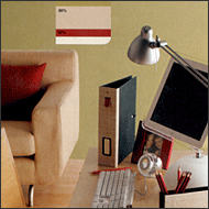
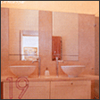
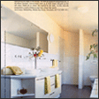
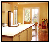
 We often paint the walls, ceiling, and exterior walls of our homes for various reasons, such as moving into a new home with dirty or unappealing colors, mismatched colors for children’s ages, too many colors causing clutter, or wanting to show a clean and elegant interior when selling a house, and so on.
So, what color and criteria should we choose for our home’s paint?
 Now, let’s select a color. Which color is good? White? Pale feeling? Ivory? Too common color? Sky blue? Hospital-like feeling? We find it difficult to choose colors. The more difficult it is, the easier it can be solved by thinking simply.
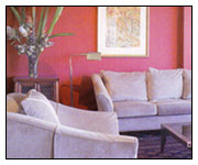
For example, in the Toronto area where we live, maple leaves are world-famous. What mood and feeling do you have when you think of that maple leaf?
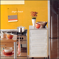
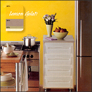
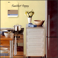
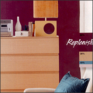
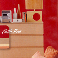
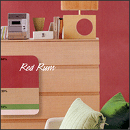
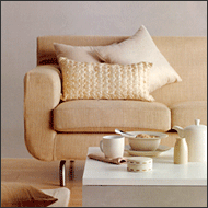
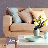
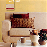
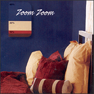
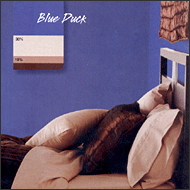
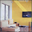
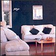
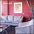
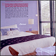
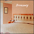
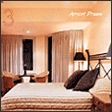
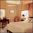
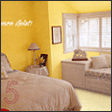
You may not know the exact colors and their names, but you will feel a very natural and romantic atmosphere. Those colors are a mixture of brown, red, yellow, and other similar colors. Do you want to have that kind of atmosphere in your home? Then paint your home with those colors. It’s a simple solution. However, those colors should be mixed colors, not primary colors, and divided into main colors, sub-colors, and auxiliary colors. Choose a slightly lighter and brighter main color and emphasize it with sub-colors and auxiliary colors or connect them.